helena fairfax, freelance editor, yorkshire

Helena Fairfax

Can you judge a book by its cover?

Can you judge a book by its cover?

A few months ago I took part in a book tour with Brook Cottage Books for my contemporary women’s fiction novel, A Way from Heart to Heart. It was good fun and a great experience, and I’m happy to say there were lots of great reviews. One interesting point came up when one of the bloggers asked her readers for feedback on the cover.

First of all, if you haven’t read the book, this is the blurb: Kate Hemingway’s world comes crashing down when she’s told of her husband’s death in Afghanistan. The man who brings her the news is Paul, her husband’s reserved friend. When Paul agrees to accompany Kate and a group of disadvantaged teenagers on a trip to the Yorkshire moors, he reveals something he’s kept secret for years, and Kate sees him in a different light. But how can she ever risk her young son’s happiness again?

You might know that, although the novel is set partly in London and partly on the Yorkshire moors, I took the title from an Afghan proverb: There is a way from heart to heart. I thought this summed up the theme of my novel perfectly, which is that, no matter how distant we appear to be from one another – through age, experience, culture, or whatever – love can always find a way.

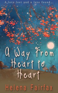
Here’s the original cover for my book, which I loved:

a way from heart to heart, helena fairfax
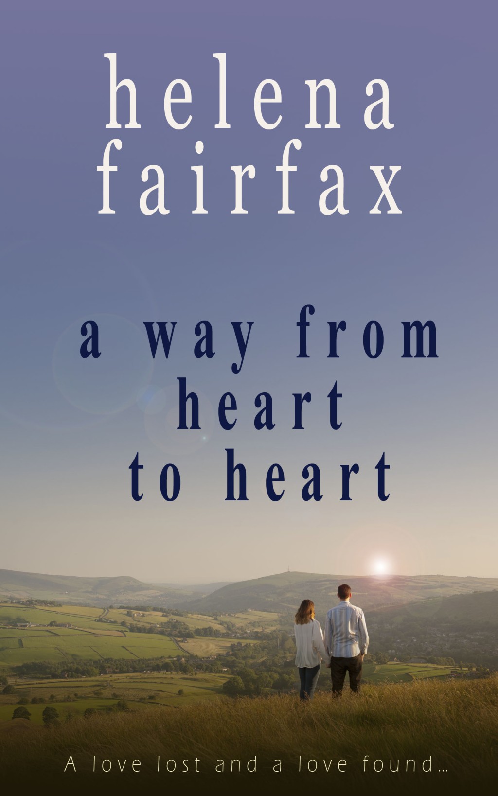
The feedback on the book tour, though, was that although readers really liked it, it didn’t convey accurately what the book was about. I do love this cover, but after discussion with my publisher we agreed to change it, so that readers would have a clearer idea of what’s in the story. I’m excited to say that I now have a new cover. And here it is!

helena fairfax, a way from heart to heart
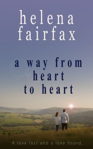
What do you think? I love the font, and I think the cover has a fresher, more optimistic feel to it. Of the two designs, I prefer the first as an image. But as a reflection of the story, I think the second cover gives a better idea of what’s inside the book.

I actually feel quite lucky to have two covers!

* * *

Which cover do you prefer? Do you study a cover before buying a book? How much does the cover influence your decision? If you have any comments at all, I’d love to hear from you!

22 responses to “Can you judge a book by its cover?”

  1. The Story Reading Ape Avatar

    The new cover is much more professional looking and in line with your other books Helena PLUS I like theuse of lower case font throughout :D

    Liked by 1 person

    1. Helena Fairfax Avatar

      Thanks for your feedback, Chris. I love the font on the second cover, too. I’m so glad you think it’s an improvement. Thanks for your comment!

      Liked by 1 person

  2. Julie Christine Avatar

    Congratulations on TWO beautiful covers. Although I find the first more aesthetically pleasing, it is abstract and the font is whimsical. The second conveys a far stronger sense of story and character and the font offers a gravitas that seems far more fitting to your subject matter. But I love them both!

    Like

    1. Helena Fairfax Avatar

      Thanks so much, Julie! I like both covers, too, and I found the decision really hard. I’m glad you think the second is more fitting to the subject. Thanks so much for dropping in, and for your comment!

      Liked by 1 person

  3. rosgemmell Avatar

    That’s so interesting, Helena. Although I love the image and colours of the original cover, I do think the new one better reflects your blurb and the setting. I too like the lower case font. It will be interesting for you to see whether or not it makes a difference to sales!

    Like

    1. Helena Fairfax Avatar

      Hi Rosemary, I’m also interested to see if this will make a difference to sales, and if readers will be more likely to take a closer look at the book. Time will tell! Thanks for dropping in!

      Like

  4. Joan Fleming Avatar
    Joan Fleming

    The original cover is pretty, Helena, but the new one says more about what’s inside. Like you, I really like the lower case font. On balance, I prefer the new one.

    Like

    1. Helena Fairfax Avatar

      Hi Joan, so glad you prefer the new one. It’s so hard to know what people are going to like, especially as I’m a writer, not an artist. Thanks for letting me know. It seems so far that most people think it’s better to go with the second. Phew!

      Like

  5. HFBrainerd Avatar

    I prefer the first cover, but agree that the new cover more accurately represents the book.

    Liked by 1 person

    1. Helena Fairfax Avatar

      That’s exactly what I think, too, Heather. Thanks for letting me know. Hopefully we made the right choice going with the second.

      Liked by 1 person

  6. marsharwest Avatar
    marsharwest

    Helena, I love the colors on the first cover. I like capital letters, so I prefer that over the all small letters. Easier for my old eyes to read. :) Because your book is a woman’s fiction rather than a straight romance, I like the first cover better. The second is a good representation of the moors, but the man and woman suggest a more traditional love story. You’re lucky to have two great covers. They’re just different. Be interesting to see if the change makes a difference to sales. Keep us posted.

    Like

    1. Helena Fairfax Avatar

      Hi Marsha, thanks for your interesting comment. I had wondered if having the couple on the front would suggest a more traditional romance. I guess the romance element is the strongest thread in the book. Very, very hard to encapsulate a story in one design. But the bottom line is as you say – will it make a difference to sales? We’ll have to wait and see! Thanks so much for dropping in, and for your comment!

      Like

  7. Mary Waibel Avatar

    What lovely covers. Not having read the book yet, I have to say I’d be more likely to pick up the first cover than the second, but I’m not sure if it’s because I’ve seen the first more (and am used to it) or because I like the colors and the feel I get from it (I sense hope and maybe a new beginning from the images).

    The second cover makes me think romance, but I’m not fond of the lowercase letters. I guess I’m a traditionalist and like to see capitals on names and in titles :-)
    However, it is a lovely cover, and I look forward to seeing how it works for you!

    Like

    1. Helena Fairfax Avatar

      Hi Mary, that’s really interesting what you say about being used to the first cover. I’ve heard people say that readers don’t pick up a new to them author until they’ve seen the book / book cover mentioned several times. Now I’ve changed the cover, that means starting again.
      As other commenters have said, everything really boils down to sales. I have no experience in marketing, so this is a complete experiment for me. Perhaps I should do another post in six months, saying how it worked out.
      Thanks very much for dropping in. I enjoyed your comment!

      Like

  8. Jane Risdon Avatar

    I prefer the latest cover, more modern and less ‘starry eyed romance,’ which messages I for one, don’t like. But I bow to the art department when necessary. Your theme is adult love, not school-girl, which the first conveyed to me. Good luck with your book and new cover. I go for the author’s name, the blurb on the back and the cover last when looking for something to read. If a new author then the blurb, the inside cover and a few pages consumed before looking at the outer cover. But that is just me. I know it will be a success Helena. :)

    Like

    1. Helena Fairfax Avatar

      Thanks so much for your comment, Jane. Interesting to hear your thoughts on the first cover. It’s very hard to make a decision without the benefit of full market research – which of course not even the biggest publishers can afford these days! So it’s all trial and error. Very interesting to hear your view. Thanks so much for taking the time to comment!

      Liked by 1 person

      1. Jane Risdon Avatar

        Helena, I have had similar experiences with having to decide – with ‘experts’ – regarding Album covers for the recording artists I managed in my past life. So much to take on board and consider: the market, the audience (reader in your case), and what the cover message says. Whether it has impact and will find itself in a POV in a store, to be spotted over and above all the other items competing for sales and so on. Different area of the arts, but same problems. In our circumstances we only got the one hit at it…if radio/journalists/critics and so forth didn’t like the cover the music would also disappear in the mass of other releases that Tuesday…before the music ever got heard I some instances. Judging the album by its cover, the book I fear can suffer the same fate. Wishing you tons of success. :)

        Liked by 1 person

      2. Helena Fairfax Avatar

        That sounds such an interesting job, Jane! In the end, you can never really tell what people are going to go for. And design in your market has changed in the same way book designs have – going from records to CDs, and going from books in shops to thumbnails online. Everything is now totally different, and it makes it even harder to predict. Thanks for your interesting comment!

        Like

  9. Marie Laval Avatar
    Marie Laval

    Congratulations on your new cover, Helena. I really liked the first cover but the second one does indeed reflect the story a lot more, and gives a strong sense of the setting as well. I like the tag line too. It will be really interesting for you to find out what readers think!

    Like

    1. Helena Fairfax Avatar

      Thanks, Marie! I’m curious, too, to know what readers will think of it!

      Like

  10. J.Q. Rose Avatar

    I agree with you, Heather, and Marie. However, (isn’t there always a however?) I am neither a marketer or artist, so take this with a grain of salt. I think the first is more eye-catching and unique. The second is more ordinary. It may be the old teacher in me about using CAPS for a title, so it grates a bit on my eyes with no capitalization! Note: amazon is not capitalized either and that bothers me. The second book is modern for sure and the story is contemporary, so that’s right on. I loved this story and how you used the saying to bring such meaning to many of the situations in the story. So many things authors have to think about when all we want to do is write.

    Like

    1. Helena Fairfax Avatar

      Hi JQ, that’s such an interesting comment. I also find the first cover more original. But is that what readers want to see in a cover when they choose a book, especially in the commercial fiction I write? Or do they want to know that a story fits in a certain genre, which I think the second cover shows more clearly?
      Interesting that you’d want the font capitalised! I don’t mind that at all, and in fact all my file names on my computer are in lower-case. I’m not a big fan of capitals, but that’s all just personal taste. Thanks for your thoughtful and interesting comment!

      Liked by 1 person

Leave a Reply

Your email address will not be published. Required fields are marked *

This site uses Akismet to reduce spam. Learn how your comment data is processed.